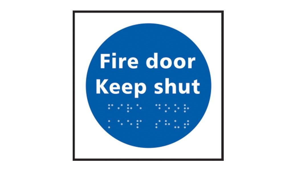
Using signs which incorporate braille lettering can be a great way of improving the accessibility of your site and facilities for people who are visually impaired. However, if you’re not using the signs correctly, they can have little to no effect. Here’s our handy guide to the right way to do it.
What Makes a Good Braille Sign?
There are three main types of signs:
- Information — These signs might include instructions like ‘Keep Door Closed’ or other information like ‘Hearing Loop’
- Directional — Pointing the way to specific facilities or services, for example ‘Reception’ or ‘Toilet’ with an arrow
- Locational — Signs that show the person the facility or room they are in front of, for example ‘Men's/Women’s Toilets’, ‘Stairs’ and ‘Exit’ signs
The most accessible type of braille sign is the one that can be easily understood by the largest range of people, including people with good vision, blind people and those with low vision. The ideal sign has clear, large, embossed lettering, embossed or raised pictograms or icons that can be easily understood and also features braille text.
Embossments should have rounded edges, so that a person running their fingers over the sign can do so with minimum discomfort. Similarly, braille lettering should be of a domed or rounded shape, with dots raised from the surface by at least 0.5mm. Engraved or recessed braille dots are not best practice, as they are extremely difficult to read.
What Should a Good Braille Sign Say?
All the information conveyed by signs around your site should be available in both print and braille — any information available to the sighted should also be made available to people with visual impairments. Directions and instructions should be unambiguous, with embossed print and braille text separated by at least 10mm to provide a distinction to the reader. At a bare minimum, you’ll want signs indicating the location of reception desks, toilets, fire exits, stairways and lifts.
Using raised or embossed arrows is a super-simple way of providing directions. Always make sure, though, that there is very little space between the arrow and the appropriate label, so as to avoid misunderstandings.
Where Should Signs be Placed?
Your braille signs should be at a consistent height throughout the premises, making them easy to locate. Similarly, where possible the signs should be at a consistent location — I.e., always the same distance from the door or switch that they refer to. If you plan to affix signage to doors, you must make sure that those doors are usually kept closed. Any signs attached to a door that is kept open are not accessible to the braille reader.
A good rule of thumb is to keep signs approximately 1200mm to 1600mm from floor level, which is the best braille reading height for the majority of adults.
Make sure that access to the sign is not obstructed — if you hang it over a bin, behind a desk or suspend it from the ceiling, people cannot physically get to the sign to touch it and read the braille.
Maintenance
The signs that you buy and install should be of a good quality, ensuring that they are long-lasting and durable. Braille or embossed signs should be checked frequently to ensure that dots are still intact and pictograms are still rounded.
Author Bio: First Mats started life as safety matting specialists, but have since expanded to become a complete industrial and commercial supplies company. The focus of First Mats is to provide safety-focused products that improve the wellbeing of staff through quality approved products, backed up by extensive knowledge.


