Using end-user needs to future-proof students’ union development
SITTING in the heart of the University of Nottingham’s (UoN) beautiful University Park campus, the historic Portland Building is one of the busiest and most active students’ unions in the UK, providing for more than 34,000 students per year.
The neo-classical style building was originally built in the 1950s but underwent a further extension in 2003, making it the main students’ union and University Professional Services Building, enhancing the flow between the internal facilities and parkland setting of the campus.
Led by national firm, CPMG Architects, the building has undergone a phased transformation to create a students’ union for the modern student.
Understanding the needs of end-users
It was clear that the Portland Building needed an overhaul to create a venue suitable for socialising and informal learning. To ensure that end-users needs were central to the redesign, extensive research was conducted by the students’ union to understand exactly what the building needed to provide.
Initial findings showed that students saw the space as too busy and hard to navigate. With the building serving multiple purposes for a range of stakeholders, the space was seen as mainly functional, rather than a destination. Lacking identity, its end-users had little emotional connection with the building and its resources.
Sara Harraway, director at CPMG said: “The research also showed that students were opting to travel into Nottingham city centre to spend their time in environments more reflective of their lifestyle aspirations. It was crucial that we designed a welcoming and safe space to encourage students to stay and spend time on campus – so this became a central element to the project.
“The building was suffering from a lack of internal connectivity, so there was the need to break down barriers between spaces and open it up into a much more vibrant and inspiring environment.”
Future proofing the build
To ensure longevity of the building, a key factor in enhancing the potential of the building was to address the needs of students and staff using the building and its facilities, but also to take into consideration the modern, flexible, technology-based society.
With its generous volumes, the Portland building was well-received by its 1950s student cohort, but since then, demands had been placed on the building to adapt in response to campus redevelopments and imposition of IT.
Sara said: “Any building must respond to the needs of its users and those needs will of course change over time. Users will adapt to their environment and but will also expect that the building adapts to meet their needs.
“As well as this, huge societal changes have taken place since the 1950s, and the Portland Building has had to adapt to incorporate a new, technological world that it wasn’t originally designed for.
“To help the space achieve its relevance as a student union, it was necessary to redefine Portland in several fundamental ways – plus plan for any known or conceivable future external demands.”
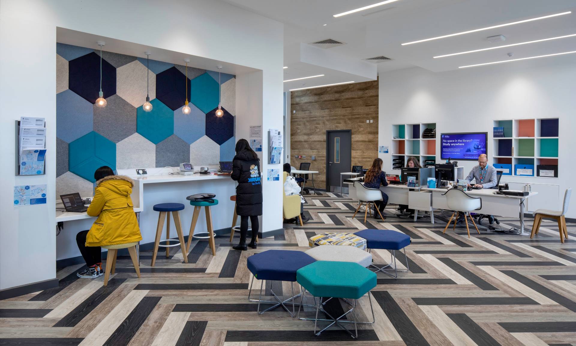
Through evaluating and observing the harmonies and tensions between building and user, it was necessary to optimise the existing space to create more accessible and agile spaces – done through using a rich palette of reconfigurable furniture types.
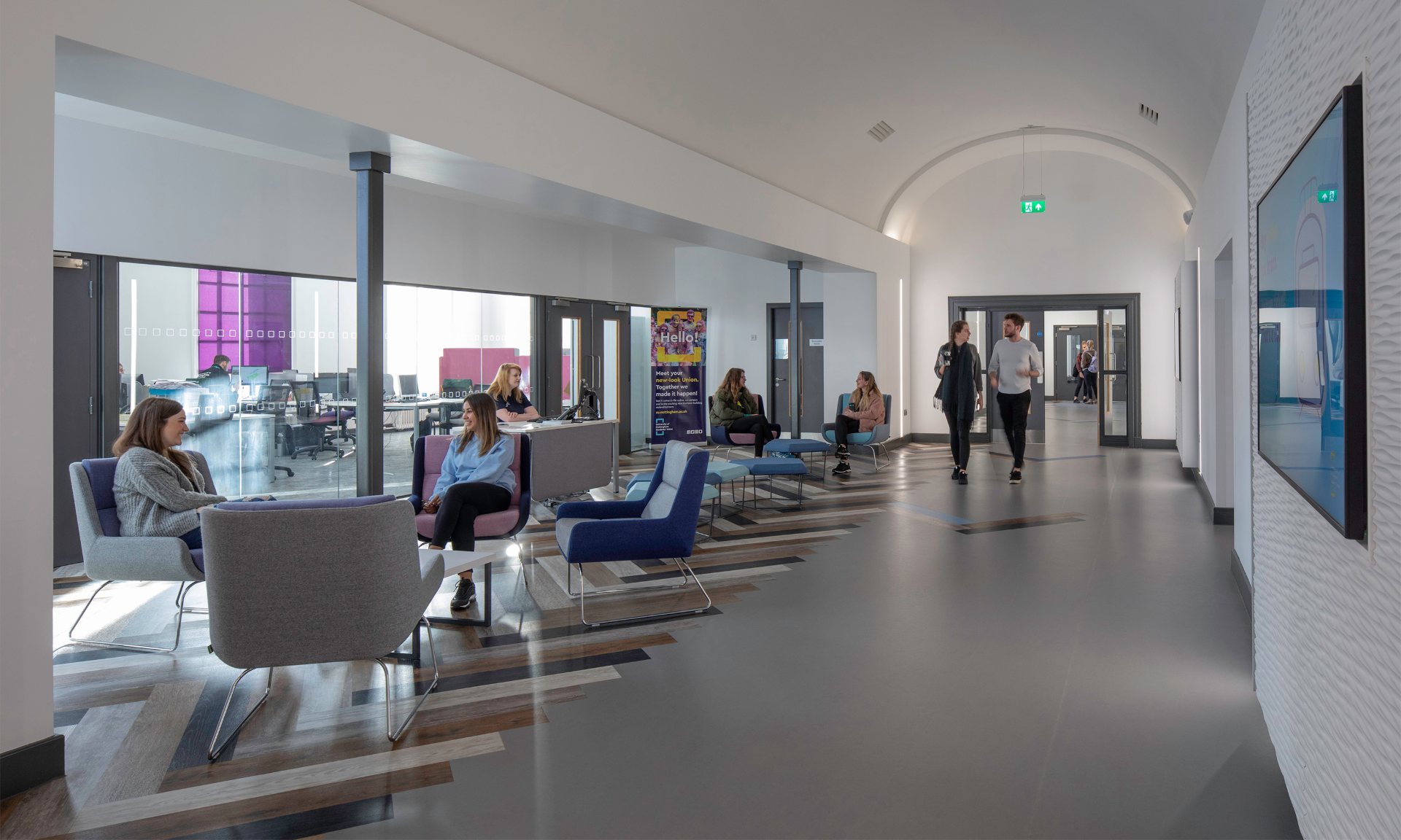
Under-utilised areas and dead spaces were completely redesigned for socialising and flexible learning. An example of this from the first phase of the project is an accessible and dynamic activity hub which revitalised the east wing, giving new life to a previously dark and unattractive corner.
An existing terrace was extended, creating a bold new performance venue. A faith zone was established, anchored around the original chapel, and a peace garden was created by extending a narrow fire escape route into a quiet contemplation space with fixed seating and integrated sensory planted. At the top of the building, the existing food court engages with its balcony terrace to create a seating area with commanding views over the lake.
Many of the existing retail units previously scattered around the building have been revitalised and now sit in one central location in a retail mall.
A new five-storey social and support hub is now dedicated to its students, which was one of the big ambitions suggested in the initial market research.
Using wayfinding to simplify building use
Before its transformation, with its abundance of people and corridors, the Portland Building felt largely inaccessible and too busy for its students. People were not able to use the space effectively, and following the 2003 extension, the main flow into the building was no longer via the main entrance of the building. Instead the gravitational pull saw the main flow into the building via the rear Portland Hill doors.
To respond to this, a clear wayfinding strategy was established, looking in detail at people movement throughout the building.
In the third phase of development, the entrance was re-orientated to respond to the natural flow of people traffic. Working with the existing building fabric, a multi-height welcome hub was formed, with a video screen projecting onto the Djanogly Steps to create an external multi-use venue.
Strategic colours, flooring, graphics and lighting were employed to make it easier for people to flow passively through the building’s new layout. Screens were also added within the main circulation zones to help navigate the building’s various activities, facilities and spaces.
Redesigning the Portland Building to address its evolving needs was not without its challenges. Achieving the aspirations of the students’ union, the design was bold yet sensitive due to the historic value of the building, strict cost constraints and tight timescales.
Sara said: “The Portland Building is an iconic, historic and ultimately well-loved one, so it was crucial to remain sensitive to both the heritage of the original 1950s building, as well as the 2003 extension when pulling together the new designs – all while maintaining the existing services and environmental strategies.
“The project was a four-year iterative process of collaborative design and post-occupancy evaluation which ultimately resulted in the creation of a dynamic, attractive student hub, equipped to respond to the evolving needs of its users.
“By finding its place in the heart of the university’s students, staff and visitors, Portland has secured itself as a relevant student hub moving into the future.”
Simplifying Portland’s organisation and the wider relationships of the spaces led to enhancing its sense of welcome, user-friendliness and its wayfinding, legibility and accessibility.
The success of the redevelopment is captured in how well the end-users have wholeheartedly embraced the building and are now using every new space generated for study, activities and other social events.
For more information visit: www.cpmg-architects.com


